iQ3Connect

PROJECT OVERVIEW
Timeline: 2 Months.
Role: UX Designer & Researcher.
Tasks: Synthesis, Ideation, Wire-framing, Visual Design,
and Branding.
Research Methods:
-
User Interviews – Gathered qualitative insights from users
-
Competitive Analysis – Assessed industry benchmarks & best practices
-
Comparative Analysis – Evaluated similar products for UX insights
-
Iteration – Refined concepts based on feedback & testing
-
Prototyping – Built interactive models for usability validation
Tools: Canva, Figma, Jira, and Miro.
Framework: Cross-functional Collaboration.
Techniques: Affinity Mapping, User Personas & Flows, Task Flows, Feature Inventory, Site Maps.
Partnerships:
-
General Assembly.
-
i3Connect VR.
An intuitive user-friendly VR platform with code-free features and interactive tools
As part of meeting the General Assembly’s graduation requirements, I eagerly participated in a client-based group project to redesign, in other words, revamp important website features for the VR software provider iQ3 Connect: a SaaS platform provider that allows users the ability to create, deliver, and engage with virtual immersive training experiences using code-free, webs-based workspace.
This XR, Augmented Reality software is run by a team of engineers & executives to provide customization of design & VR software that targets manufacturing enterprises and industrial companies at large with the service of creating a no-code visual editor to make building immersive training as easy as working on a PowerPoint.
-----------------------------------------------------------------------------Research Phase
-----------------------------------------------------------------------------
I started by researching the business, the services it offers, its current users, and other competitors and comparators in the industry. To put things on paper, the first step was to create concrete interview questions that were posed to current and potential users of the platform. These interviews took place over Zoom video conferencing and survey links, which were created and sent to those who reside in time difference zones. Based on these two interview methods, we were able to generate trends using affinity mapping (a management and planning tool), which enabled listing and sorting ideas in an organized way.
Business Analyses
This process involved researching specific features and services among competing and comparable entities in the industry. In more precise terms, the goal was to discover what has been working for these businesses and what has not and utilize our findings to help make better solutions for the client. Some remarkable examples of these features and tools include collaborative VR and shared workspaces as well as software companies that incorporate a good use of product customization within VR interface, on-site step-by-step tutorials, and a clear, intuitive path between viewing models and code script manipulation.
The analysis led to asserting the importance of designing an easy to follow interface, registration-free web-based shared VR space, and catering different audiences in a user-friendly UI. Ultimately, the goal was to allow users to access and use the platform regardless of their coding backgrounds. All while keeping in mind the platform’s importance of not requiring a VR headset, a library reference preventing independent training creation, and submission requests for viewing demos.


.jpg)
Affinity Mapping trends
Upon interviewing current and potential users of the platform, a lot were similar in attaining some coding/programming background. This familiarity with coding/programming has been helpful to these clients in allowing them to create tasks within training more intuitively. Thus, revealing that the clientele to design and carter for was not represented among the users who participated in this study. Rather than creating a persona based on iQ3’s current users, who are more advanced in have experience using the platform. Thus, making the platform more accessible for novice users to expand iQ3 client base has become a priority. Another trend was lacking an efficient set of features and tools to use on the platform. Some icons and terminology could be a little confusing . Nevertheless, these clients still prefer to use the platform because they find it easier to create training materials than what competing businesses offer.
Furthermore, the ideation process consisted of using the Moscow prioritization feature, sketching, and creating a navigational structure. As will be demonstrated, the combination of these elements helped make the site navigation as easily and conveniently as possible while ensuring the ability to create training, all of which contributes to an optimal user experience. Lastly, the comprehensive wireframing process implemented the use of low-fidelity, mid-fidelity, and smart prototyping to produce both efficient and creative task flows.
The Situation at Glance:
This section highlights areas that needed development prior to my team’s intervention. After having conducted research and documented user’s experiences, my teammates and I tested the platform and observed that the software would prompt users to navigate to the VR space to manipulate objects where they have to create a scene and access the dashboard to upload files or documents in advance. When uploading things from the dashboard you’re not able to see the VR space. In the case of users missing to upload a certain file while trying to create a training, they’d have to go back to the dashboard and upload the file after having to confirm the selection before going back to the VR editing space.
The script editor in the original original design was not intuitive to use. While this feature allowed for manipulating objects in addition to adding actions, animations, etc. for training, it would require some coding. Although the majority of the users have backgrounds, they would still need help from iQ3Connnect personnel to navigate through creating their training. While users are able to view a glossary with code blocks and commands as they find necessary to add, they would still have to click on a unintuitive icon next to the Explore on the script editor’s dashboard.

The problem
Despite iQ3’s sophisticated technology that appeals to several businesses, the platform is not accessible because their user interface is very complex and demands a lot more training than they would like to have necessary for new users who are unfamiliar with the platform.
After analyzing the situations, it is obvious to assert that iQ3Connect users need an intuitive flow to navigate the creation and editing of complex training modules. Currently, clients build training through manipulation of the script in which they search actions within the glossary, copy and paste the code block into their training script, and make adjustments to reflect the desired command. This method requires users to navigate between the VR workspace and the script editor to build steps. The process leaves users feeling confused and overwhelmed, often depending on assistance from iQ3 experts to create more advanced training materials.
Q: How to create a streamlined experience for novice users to create sophisticated training without the need for script manipulation?
The solution (from a designer’s perspective):
To design a user-centered interface in which users can intuitively create complex training modules.
Simply put, taking down the barrier between novice users and the complex tools and making it more approachable by redesign the iQ3 platform to create a framework to manage all capabilities simultaneously consisting of creating scenes, interactions, animations, and steps, alongside the VR perspective to demonstrate real-time progress. The redesign will includes creating a visualization of non-linear timelines to represent the training paths users are able to take.
-----------------------------------------------------------------------------
Design Phase
-----------------------------------------------------------------------------
When users enter the editing workspace, the main sections they
will encounter are the Action Panel (left column) and Resource Hierarchy
(down column). The former allows users to create steps and interactions
within the training while the latter gives users a quick overview of
the different types of media they could upload and plan to use when
creating their training.
Action Panel: Steps creation
When the Steps option is expanded, after being selected, users will be prompted to create a new step; which consists of Scenes, interactions, and animations. Users are now able to select a desired scene prior to creating it directly from the dashboard in a more streamlined process instead of going back and forth between the homepage and the editing space. Users are also able to choose interactions to, for example, rotate resources, choose time frame, and the resources that they try to manipulate within a training. Lastly, animations (in the form of audio or video content) can be added and displayed without the user’s intervention.
Resource Hierarchy: Timeline
Upon filling out these fields on the Action Panel, a timeline will appear in the Resource Hierarchy, located at the bottom half of the screen to show the user what their selected scenes and actions would look like in a given step of their training. This timeline will be replacing the resources panel and it can be selected by clicking on the only icon under
Steps. The timeline will inform users how all of the selected scenes, interactions, and animations can overlap and at what time they occur. All of which aims to provide the users with a visual representation of the training and editing the material within while ensuring there’s no overlap in the use of materials.
Uploading Materials
The Resource Hierarchy is designed to offer a convenient space for users to upload materials from their desktop or access previously uploaded ones. Either option will appear after selecting the folder icon in this section.
In addition to the Action Panel and Resource Hierarchy, the editing space includes other important features including the Script Editor and Tree Timeline located at the top right corner of the editing space.
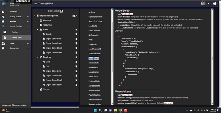
Script Editor:
While the client requested keeping the code editing space, despite being one of the users’ struggles, my team and I decided to improve the way it works without the need to abandon it. Instead of having to exit the editing workspace to access the script editor, users now can manipulate their coding script more intuitively and efficiently through their editing workspace. It all starts by clicking on the script editing tool at the structural navigational at the top right of the screen. A pop-up menu will appear with a Glossary option to view the coding block and all necessary commands related to editing the script.
Tree Timeline: Materials Used
After having created the steps, uploaded files where necessary, and manipulated the script, now we are ready to dissect each step further by showing the resources, interactions, and animations embedded within. Before doing so, we start by clicking on the Tree Timeline icon which will bring us to an enlarged image of all steps created previously. Thus, providing the user with an overview of what has been used after those steps were created. The resources, interactions, and animations will be displayed and vibrantly highlighted at the very bottom outside the frame of each step, which will be demonstrated with an image of a particular model.
Outcomes & Accomplishments:
-
Upgraded web-based Instant VR workspace, resulting in a 40% increase in training creation features usability score.
-
Designed an intuitive user flow forclients to navigate the creation of more complex training modules and allow the bypass of the script manipulation.
-
Created an interface that manages capabilities, interactions, and steps in editing tutorials within the platform’s dashboard pieces accessible alongside the VR perspective with real-time progress.
Client Testimony


"Fantastic work! This was not an easy project by any means, but you all handled it skillfully and delivered a great UI concept that will lay the foundation for what gets incorporated into the project"
Colin Bloor, Director at iQ3Connect.